
UI customization has been a hot topic with constant disagreements between developers, vendors and consumers. Brands have the need to theme public-facing interfaces when software design demands consistency, accessibility assurances and somehow retain visual appeal.
During the height of Linux ricing, anyone on GNOME will remember the “Stop theming my app” movement. A rift between user needs and overworked developers. I was one of the survivors of the shift to libadwaita (if you know, you know), and the lessons I learned heavily influenced the decisions we made: theming osTicket 2.0.
Introduction
So you want to theme your application. Well you’re in luck, building a design system is easy. Getting users to like your design system is a whole other story. We can talk about it someday. But today, we want to use a colour wheel with all the infinite wavelengths on the spectrum and then some. We need the dimmest dark modes and the blackest AMOLED.
1. Semantic colors
Every brand needs a primary colour. We’ll use this on buttons and switches and input tones and everything in the mix.
We’ll also need a neutral colour, we can of course choose the easier route “grey”. And finally our constructive and destructive colours, or your success and danger. We can also throw in info and warning colours, but remember, the more colours we add to our palette, the more conflicts we get trying to match this to the primary brand colour.
2. Contrast
This problem is split in twain:
We need to manage contrast on both light and dark schemes
We also need to allow users with visual impairment to dial up their contrast to eleventy-four
What this means is that all four brands in our user base that require shades of silver should still be able to read the text on their dashing silver buttons.
3. Design traps
We had to consider at least 2 tiers of elevation (excluding background generators). Adding shadows and glassmorphism is a common pitfall, it almost always fails.
Algorithms
From a single RGB or HSL value, we can generate multiple tones from 100 to 900 with black and white at the very edge. Our semantic colours have to be standard across schemes, and finally we need neutrals.
Our scale of neutral colours shaded from 100 to 900 provide elevation and text colours, which can easily be inverted on dark modes.
Finally we have to come up with names for different elements, for both background and foreground colours across primary surfaces, containers etc.
The Picasso Principle Good artists copy but great artists steal. And I want to be a great artist
Looking through tens of UI libraries and design systems that solve the exact problem we’re after led us back to two of the biggest library maintainers in the business: the Material Foundation and Fluent v9. The most intriguing find was by Google who adopted the HCT model (abbrev. Hue Chroma and Tone). Albeit, the Material 3 design spec is not everyone’s cup of tea. Emulating the branding approach of companies like WhatsApp and Slack, where material design elements are used in the most subtle way they could, you end up with a system most people can appreciate.
You don’t have to calculate this yourself. Material Colour Utilities do a pretty good job at this.
Plug the resulting colours into your fixed set of colour variable names and voilà!
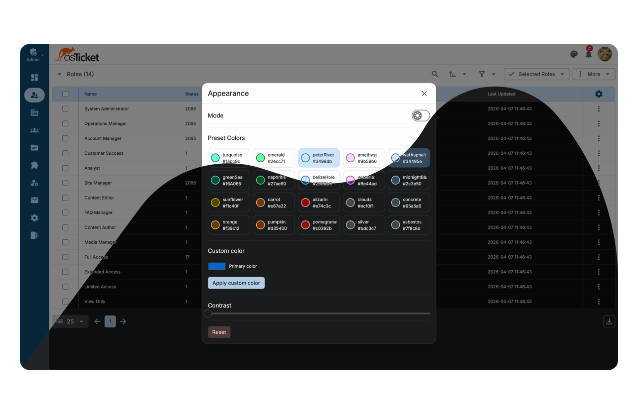
The Result
This was the most fun part of our research; testing against the FlatUI palette.
Images, Typography & Iconography
The system we’ve designed is flexible enough to support custom brand images and depending on user feedback, we will look into shipping theme plugins for more aggressive shifts. Typography and Icons can easily be swapped via a simple registry via Iconify (more on that later).
Final Thoughts
Theming my desktop environment was what got me into using Gnome and KDE in the first place. We’re bringing that kind of power to you; ricing osTicket 2.0 has been made way more accessible, mod responsibly.
Stay tuned to see excerpts of the source implementation.